Brand Identity
Stonewood — case study
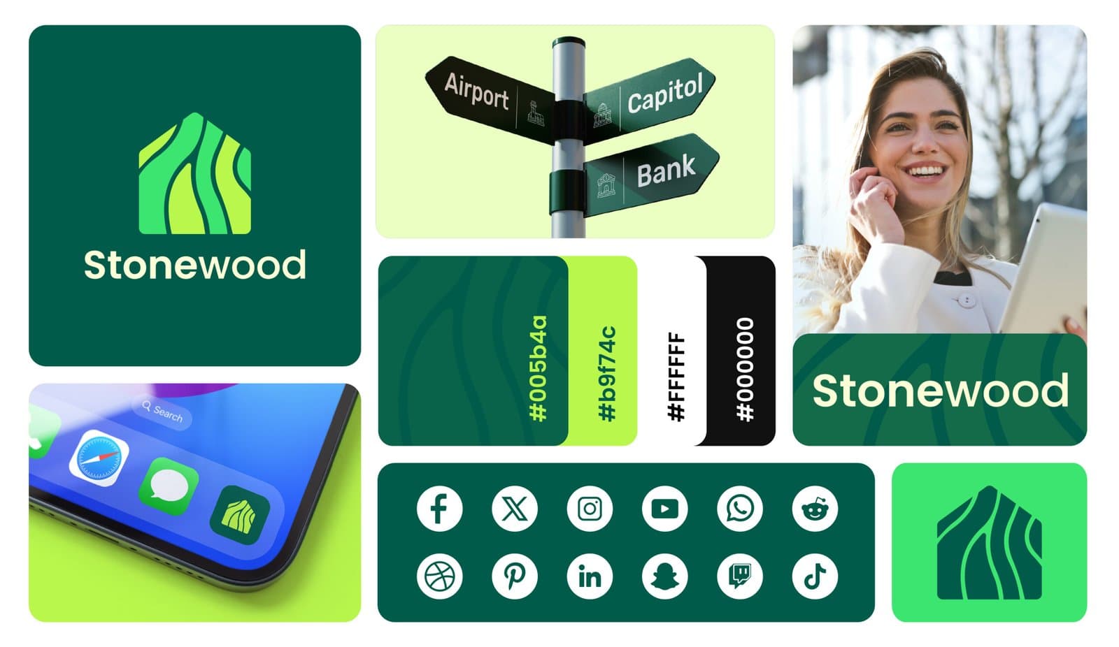
A modern visual identity concept pairing a distinctive symbol with a grounded, adaptable brand system.
- Logo Design
- Visual Identity
- Brand System
Project type
Brand identity
Industry
Identity concept
Services
Logo + visual system
Primary focus
Distinctive mark
The challenge
What needed to work better
The identity needed to feel contemporary and recognizable while remaining practical enough for a range of print and digital applications.
The approach
How we approached it
- 01
Distinctive symbol
The core mark uses a simple silhouette that can remain recognizable at different sizes.
- 02
Grounded visual palette
Color and typography create a composed personality around the central symbol.
- 03
Application testing
The identity is explored across realistic touchpoints to check consistency and flexibility.
The outcome
What the project delivered
These are qualitative design and experience outcomes visible in the completed portfolio work; no unverified commercial metrics are used.
Strong identity foundation
The finished concept combines a recognizable mark with a clear supporting system.
Flexible brand usage
The symbol and wordmark can work together or independently across applications.
Consistent presentation
Mockups demonstrate how the visual language can remain connected across formats.