Coffee & Hospitality
Star Maker Coffee — case study
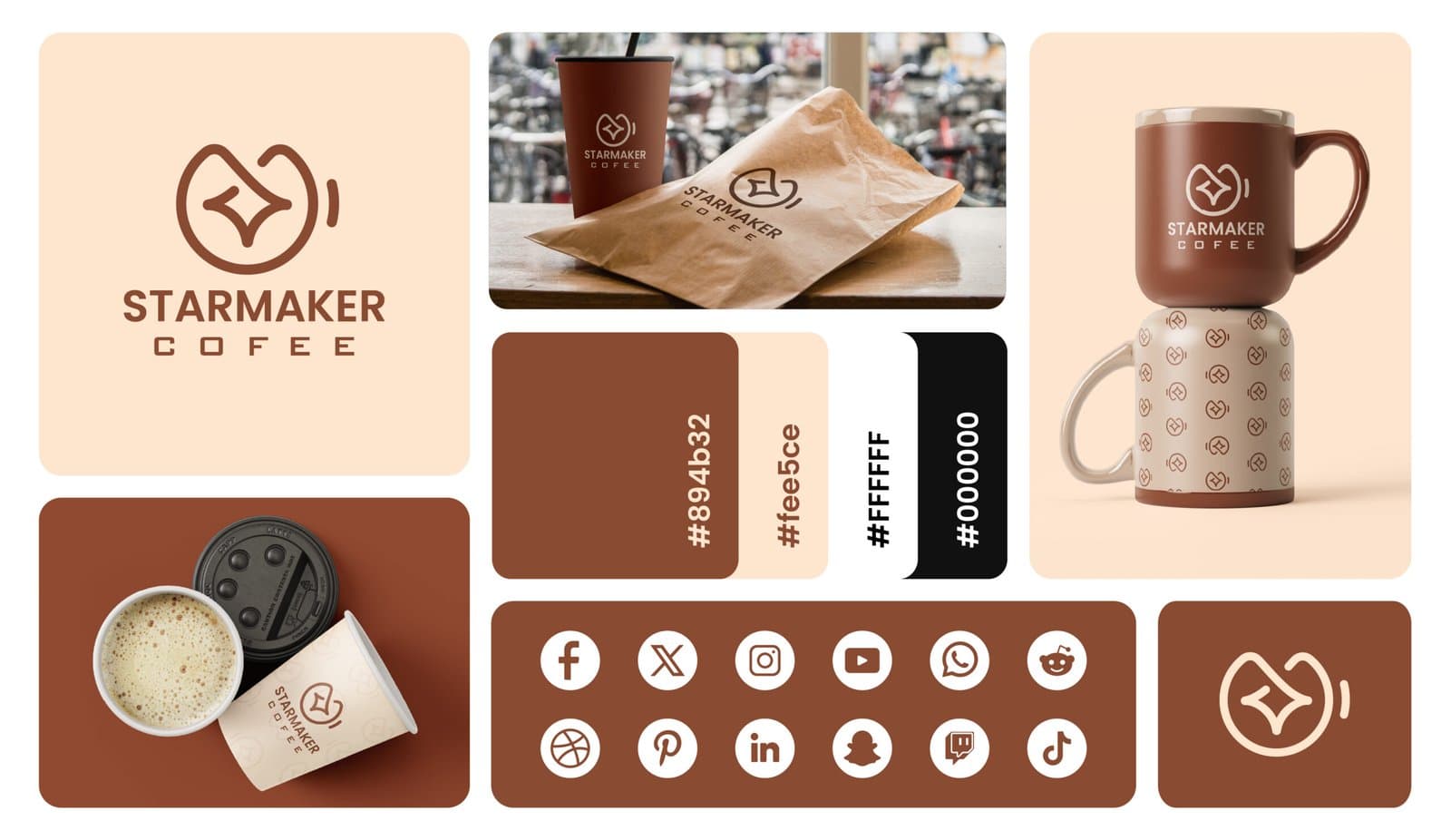
A warm coffee identity concept with a simple signature mark and a rich, hospitality-focused visual palette.
- Logo Design
- Coffee Brand
- Visual Identity
Project type
Brand identity
Industry
Coffee & hospitality
Services
Logo + visual system
Primary focus
Warm recognition
The challenge
What needed to work better
The identity needed to feel welcoming and ownable while remaining simple enough for packaging, signage, merchandise, and small-format digital use.
The approach
How we approached it
- 01
Signature brand mark
A compact symbol gives the coffee brand a distinct visual signature.
- 02
Warm tonal direction
Earthy color choices create an inviting hospitality feel around the core identity.
- 03
Packaging-conscious system
The mark and supporting typography are considered across cups, bags, labels, and signage.
The outcome
What the project delivered
These are qualitative design and experience outcomes visible in the completed portfolio work; no unverified commercial metrics are used.
Recognizable coffee identity
The concept balances warmth, simplicity, and a memorable central mark.
Consistent hospitality tone
Color and typography establish a coherent personality across brand touchpoints.
Flexible application set
The identity can scale from compact packaging details to larger environmental graphics.