Brand Identity
LinkBridge — case study
A connection-led identity concept built around a bold mark, clear contrast, and confident digital applications.
- Logo Design
- Brand Identity
- Digital Applications
Project type
Brand identity
Industry
Identity concept
Services
Logo + visual system
Primary focus
Connection
The challenge
What needed to work better
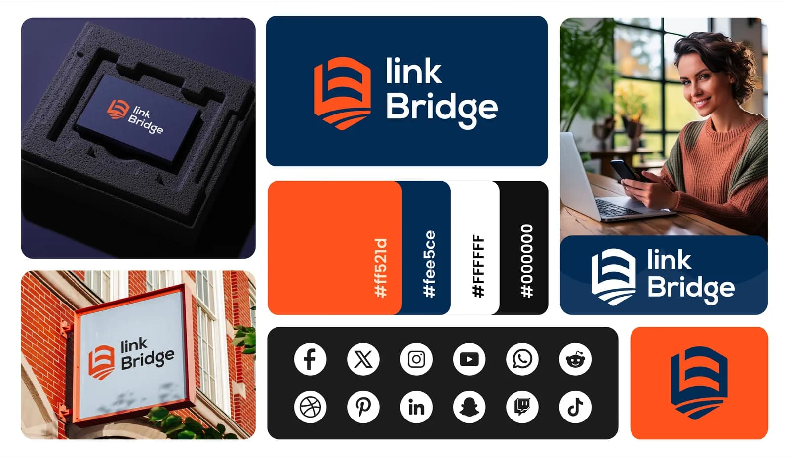
The concept needed to express connection and forward movement through a mark that could work clearly in compact digital spaces and larger brand applications.
The approach
How we approached it
- 01
Concept-led symbol
The mark combines structural forms into a compact visual idea centered on connection.
- 02
High-contrast palette
A focused color system gives the identity strong recognition across light and dark contexts.
- 03
Digital-first application
The system is tested in interface, social, and device-based presentations.
The outcome
What the project delivered
These are qualitative design and experience outcomes visible in the completed portfolio work; no unverified commercial metrics are used.
Clear brand concept
The visual identity communicates its central idea through a memorable mark.
Strong digital visibility
Color contrast and simplified forms help the identity remain legible on screens.
Adaptable asset system
The mark supports icon-sized use, full lockups, and broader branded layouts.