Food & Hospitality
Dining Domain — case study
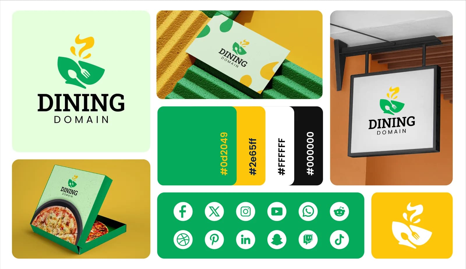
A bright food identity system designed to feel welcoming, memorable, and flexible across customer touchpoints.
- Logo Design
- Brand Identity
- Food & Hospitality
Project type
Brand identity
Industry
Food & hospitality
Services
Logo + visual system
Primary focus
Recognition
The challenge
What needed to work better
The identity needed enough personality to feel distinctive in a food context while remaining simple and consistent across packaging, signage, social content, and digital use.
The approach
How we approached it
- 01
Memorable core mark
A compact symbol and wordmark establish a recognizable foundation for the identity.
- 02
Appetite-led color system
A lively palette gives the brand warmth and supports clear variation across applications.
- 03
Flexible brand assets
Supporting patterns, icons, and layout treatments extend the identity beyond the logo.
The outcome
What the project delivered
These are qualitative design and experience outcomes visible in the completed portfolio work; no unverified commercial metrics are used.
Cohesive visual identity
The mark, colors, typography, and supporting graphics work as one connected system.
Recognizable applications
The identity remains clear across packaging, digital content, and environmental mockups.
Reusable brand language
The system provides a practical foundation for future customer-facing materials.